Rock Gomes

Flex Academy

The Flex · October 2026 · design challenge

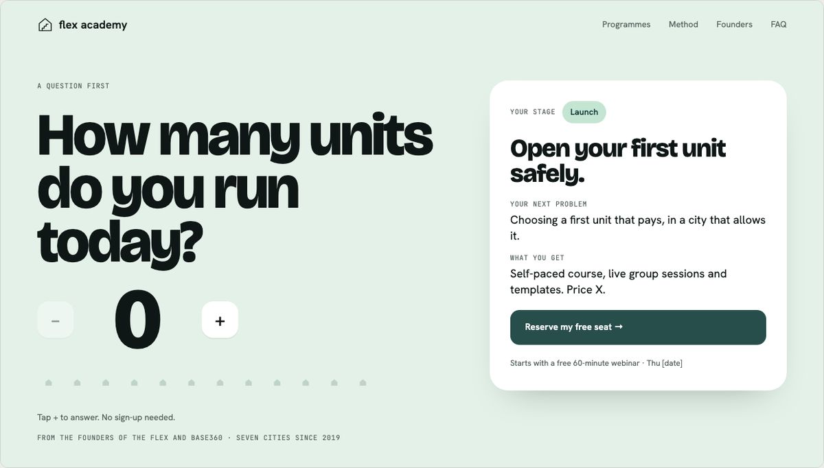
A design challenge from The Flex. Flex Academy teaches people to start and grow a short-term rental business. The page had to work for someone with a 9-to-5 job who has never rented out a flat, and for an operator who already runs a few. I designed one page with a switch between the two readers and built it on a token-based design system in Figma. I also shipped a working prototype in light and dark, with automated accessibility tests.

role
Product designer, solo. Strategy, research, art direction, UI, design system, prototype.
context
Take-home challenge for a Product / Brand Designer role at The Flex, October 2026.
made
Desktop and mobile pages, both booking flows, dark mode, design notes, Loom, Figma prototype, coded prototype.
tools
Figma (variables, components, Motion), HTML, CSS, JavaScript, Playwright, axe, Netlify, Claude.

problem

One page had to work for two very different readers. Both are tired of "guru" courses. A new company has no students and no reviews to show it can be trusted.

decision

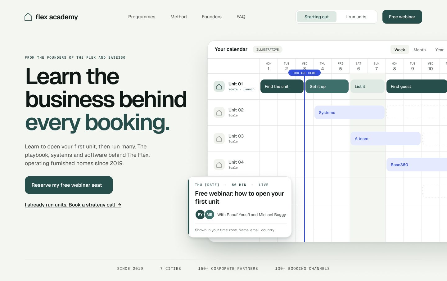
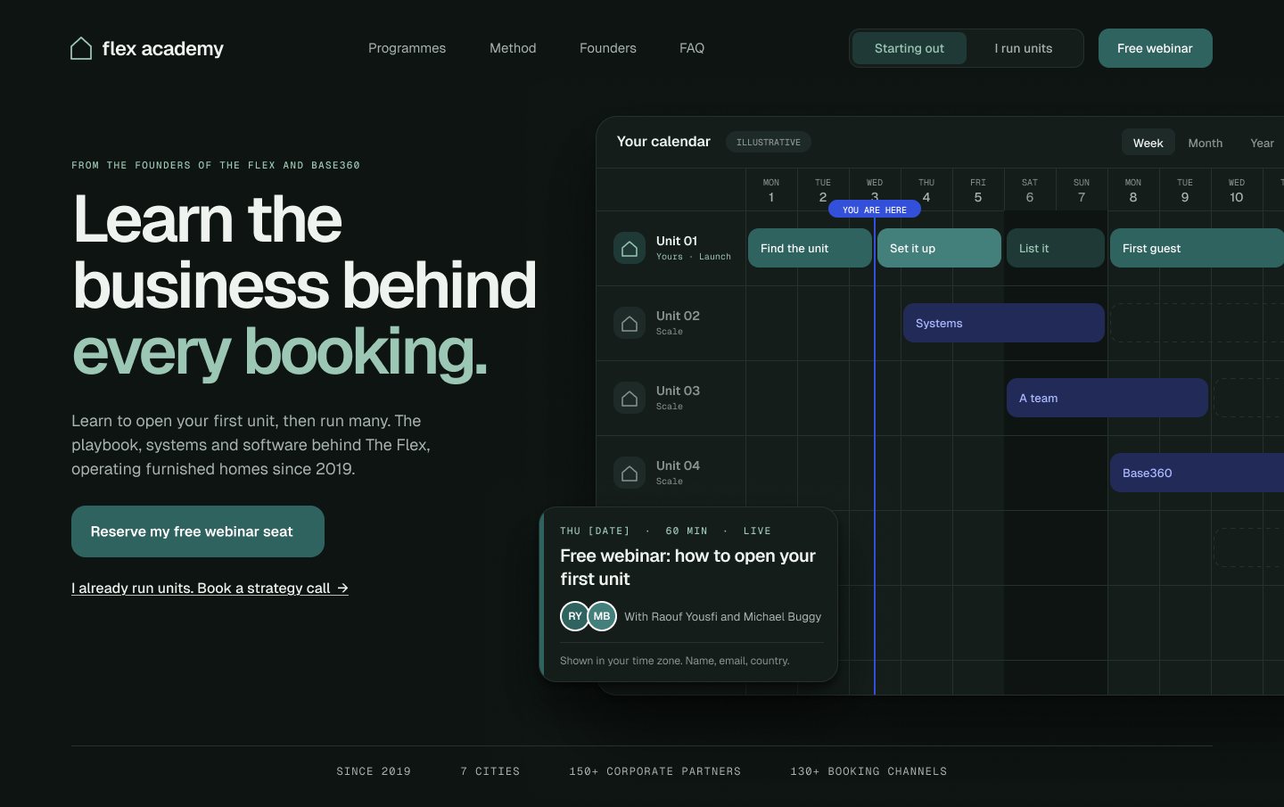
The hero is a calendar. The first row is your first unit, the rows below are the units you add next: the path from Launch to Scale in a tool operators already know.

result

Desktop and mobile pages, both booking flows with no dead ends, dark mode, and a coded prototype that checks accessibility on every push. No launch numbers: it was a take-home.

flex-academy-prototype.netlify.app
The live page, scaled to fit. Try the switch, the calendar and the theme toggle.

Three decisions I would defend

the ideas that made the page work

decision 1 of 3

The calendar is the main idea

Operators use a calendar all day: bookings, check-ins, cleanings. So the hero is a calendar. It passes the 5-second test without a slogan: the visitor sees their own first unit and the units after it. The “You are here” marker moves when the reader switches path.
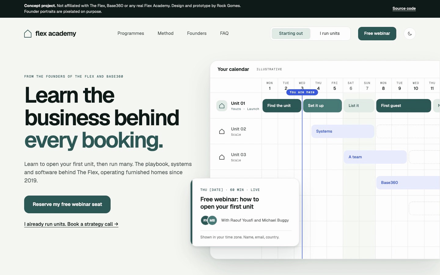
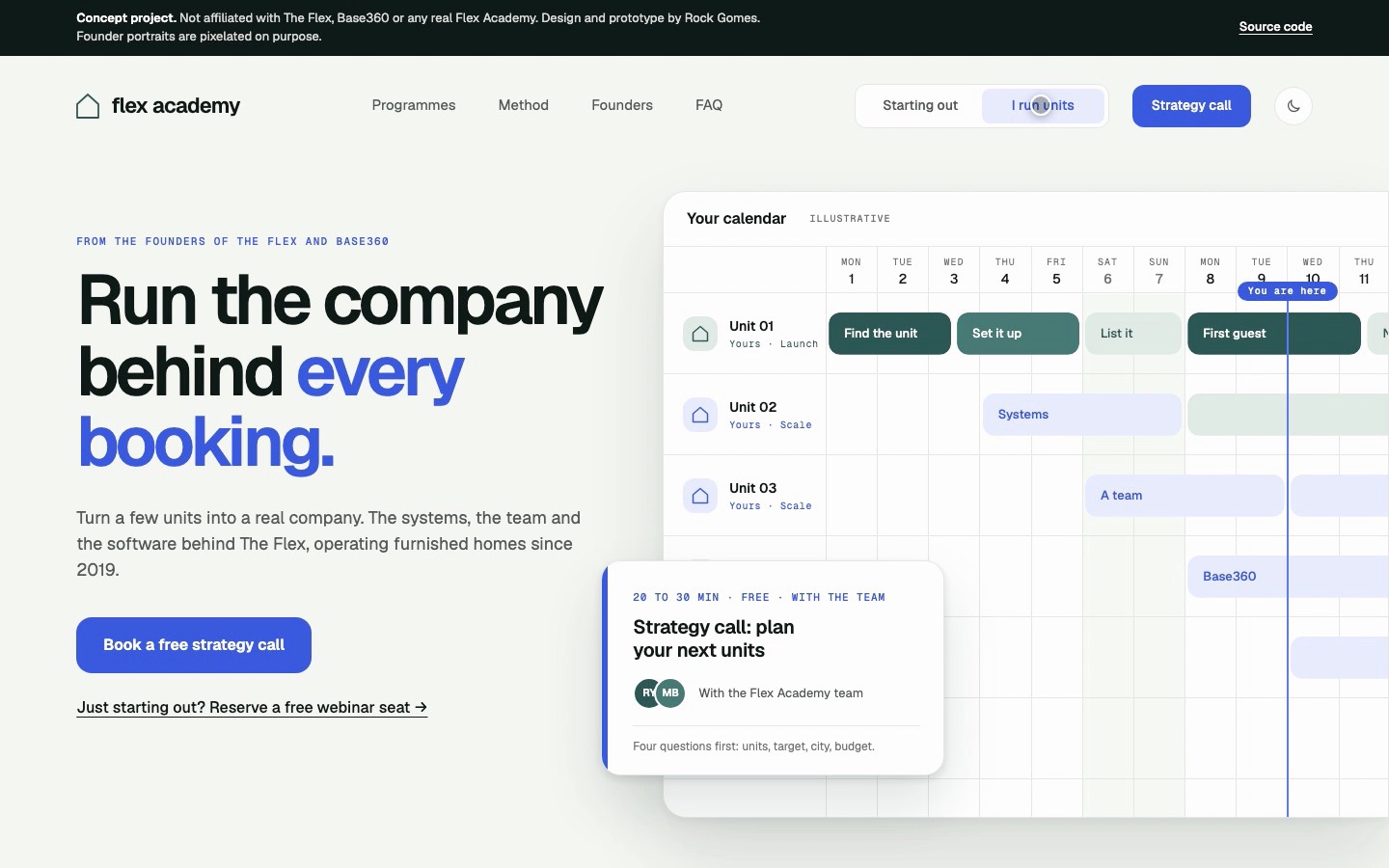
The Flex Academy hero for an operator: "Run the company behind every booking", a strategy call button and a calendar with several units.
The same hero for an operator: "I run units" changes the headline, the button and the calendar, and moves the "You are here" marker.

decision 2 of 3

The call to action is a booking

The free webinar sits on the calendar as an event, with a date, a length and the hosts. So signing up feels like booking one hour of your time. The strategy call asks four short questions first. If you answer “no units yet”, it offers the free webinar instead, so every reader has a next step.

Launch: name and email, then the confirmation. 26 seconds.

decision 3 of 3

Only facts I can source

I used no income claims, no countdowns and no fake testimonials. A section called “The hard truth” shows one real day across three units, first without a system and then with one.

  • since 2019
  • 7 cities
  • 150+ corporate partners
  • 130+ booking channels
As you scroll, the same day shows first without a system, then with one.

How I got there

the process, short

method · seven steps

Seven steps, solo or with a team

The same steps, two ways: what I did alone in the time I had, and how I would run each step as a lead, with a PM, an engineer and a researcher.

what I did · two jobs, four principles

Two jobs-to-be-done, one per reader, and four principles that became the review criteria.

  • Found the real problem in the brief: trust
  • Wrote what each reader needs to believe
  • Set the rules: sourced facts only, AA by default

Gate: every later choice is checked against the principles.

why this step matters

The brief is about trust. Framing it that way changed every later choice.

with a team · how I would lead it

A one-hour kickoff with PM, engineering and research. We agree the jobs, the success metrics and what we will not do.

  • PM owns the metrics and the guardrails
  • Engineering flags constraints early: CMS, forms, analytics
  • Principles written down and shared, so critique has a reference

Gate: signed-off brief on one page.

what I did alone

Two jobs-to-be-done, one per reader, and four principles that became the review criteria.

research

45 references, each with a reason

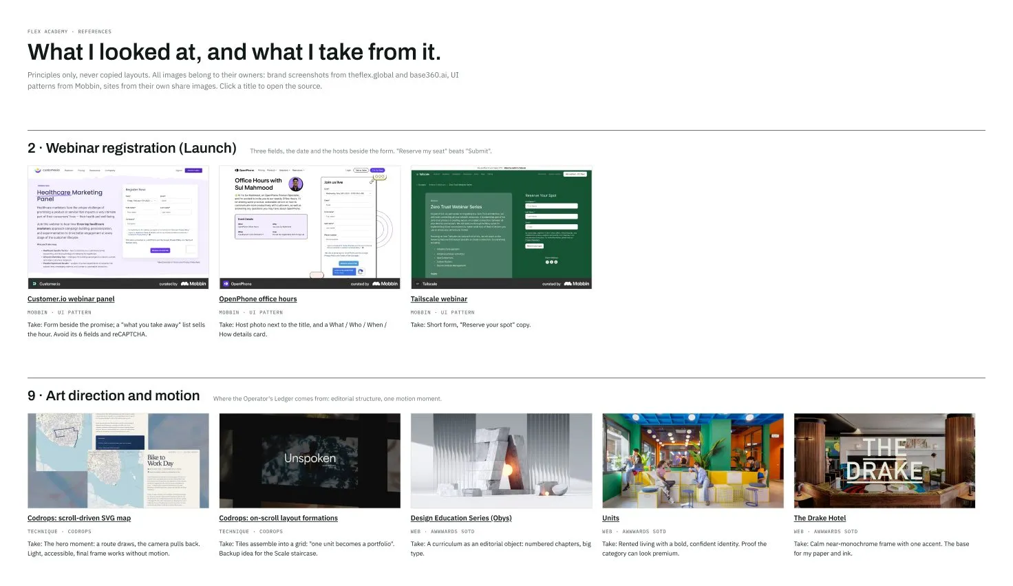
I went through theflex.global and base360.ai for every public fact. Then I collected 45 references from Mobbin, Awwwards, Codrops and others. Every card ends with “Take:”, the one thing I use from it.

Part of the References board in Figma: webinar sign-up patterns and art direction references, each with a written takeaway

structure first

The wireframe had the right structure

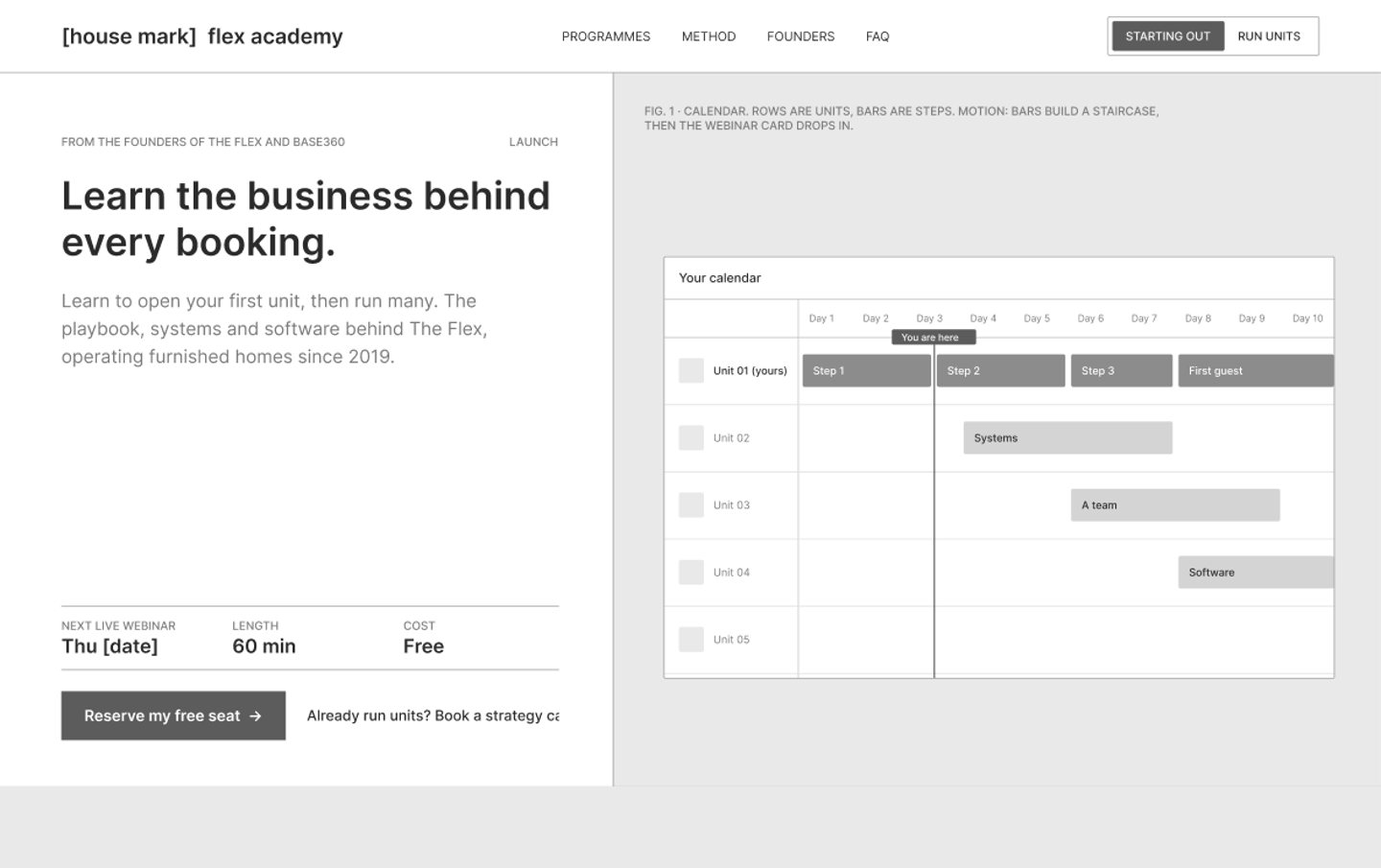
The wireframe had ten sections, each with one job, and both booking flows with every state. The structure worked, but the page was only boxes and lines.

Final hero with the calendar Wireframe of the hero: boxes and lines wireframe final

art directions

Three art directions with the same content

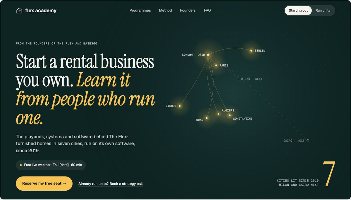
I explored art directions side by side with identical content, so only the idea changed. I judged each one against the three tests of the brief and the four principles.

Lights On: a night map where The Flex cities light up
Lights On. The Flex cities light up one by one from London. Strong proof and a real "wow", but the night mood felt far from a practical business.

The design system behind it

every layer on a token, in Light and Dark

inspect

Inspect the tokens on the hero

47 primitives, 30 semantic tokens with a Light and a Dark mode, 20 spacing steps and 8 radii. Each pin is a real layer in the Figma hero. A click on a pin lists its tokens, and Dark shows the same layers with new values.

Desktop hero in Light mode Desktop hero in Dark mode, same layers

15sets

component sets, each with a description

54variants

with named properties, no detaching

36styles

text styles in six roles

2modes

Light and Dark, on every page

coverage, measured by a script over all 785 layers of the desktop page
77/77 strokes on a token · 329/329 text on a style · 118/118 radii on a token · 1,182/1,182 gaps and padding

Built as a working prototype

a prototype built with production habits

production habits

  • Same names in design and code: the CSS properties use the Figma token names.
  • Real dark mode: it follows the system setting, and a toggle overrides it.
  • Checks on every push: HTML validation, axe in light and dark, no sideways scroll from 320 to 1920 pixels, both booking flows end to end.
  • Every change through a pull request with its own preview link.

how I worked with AI

I used Claude as a fast helper. I made the decisions: who the page talks to first, the calendar idea, what counts as proof, which directions to drop. Claude helped me research faster, gave me options to react to, wrote most of the prototype code from my specs and ran the checks. I reviewed everything on the page.

If it shipped

how I would measure it, and what I learned

how I would measure it

  • Launch: webinar sign-ups per visitor, and show-up rate on the day.
  • Scale: strategy calls booked per visitor, and the share rated as qualified.
  • Guardrails: wrong-path bookings, form drop-off per step, accessibility regressions in CI.

what I learned

  • Do the structure first and the look second, but start the look early. Comparing directions with the same content let me judge the idea itself.
  • Saying no to fake proof made me find a better idea.
  • With the token system, dark mode needed only the Dark token values and one toggle.

next case study