Pipedrive - interactive Panels
Overview
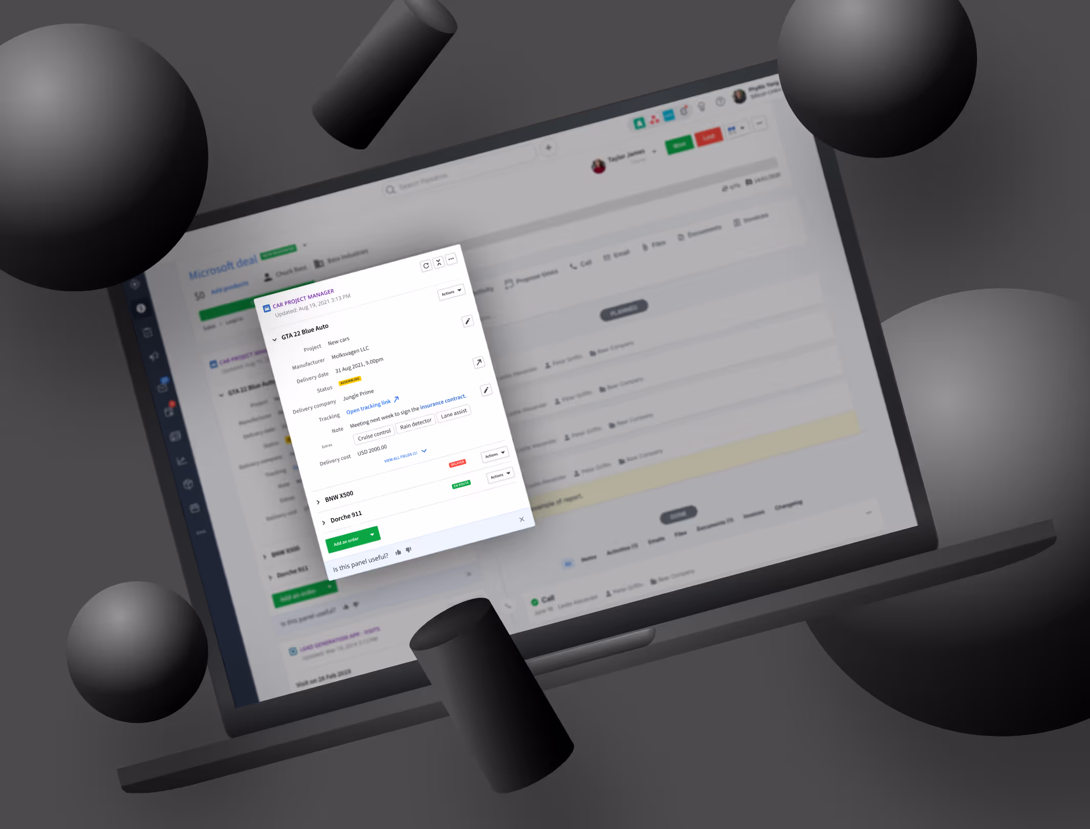
At Pipedrive, app panels allow users to view data from third-party integrations directly inside the CRM. However, before this project, panels were largely passive. They displayed information, but users could not easily act on it without leaving Pipedrive or navigating through additional menus.
I worked on redesigning app panels to make them interactive and actionable. The goal was to improve discovery and usability of integration actions, increase engagement with third-party apps, and create a scalable interaction model that could be adopted by partners across the Pipedrive Marketplace.
The Problem
While app panels provided useful context, they introduced several UX limitations:
- Panels were mostly read-only and passive
- Actions were hard to discover or not visible at all
- Users had to leave the panel to perform simple tasks
- Integrations felt disconnected from core Pipedrive workflows
This reduced the perceived value of integrations and created unnecessary friction, especially for users who rely on connected tools as part of their daily workflow.
My Role
As a Product Designer at Pipedrive, I worked closely with product managers, engineers, and other designers to:
- Explore how actions could live directly inside app panels
- Define interaction patterns that scale across integrations
- Balance user needs with technical constraints of the platform
- Ensure patterns were clear for both end users and integration partners
This project required close collaboration and a strong understanding of platform and ecosystem design.
Research and Discovery
To better understand the problem, we looked at:
- How users currently interacted with app panels
- Which actions users expected to perform on third-party data
- How discoverable existing actions were
- Technical constraints related to Marketplace apps and schemas
Internal data showed that only around 30 percent of users discovered available actions before release. This insight reinforced the need to surface actions more clearly and closer to the data they relate to.
Design Approach
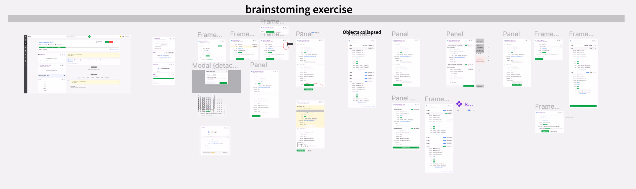
Rather than designing isolated screens, I focused on defining interaction patterns that could be reused across different panels, apps, and data types.
Core principles
The work was guided by a few key principles:
- Action close to data: Actions should live where users naturally look
- Progressive disclosure: Show key actions first, with secondary options available when needed
- Consistency across apps: Interactions should feel familiar regardless of the integration
- Scalability: Patterns must work for many partners and use cases
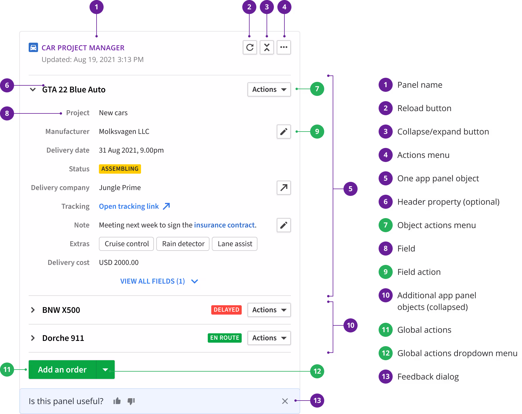
From static panels to interactive flows
The solution introduced several interaction layers:
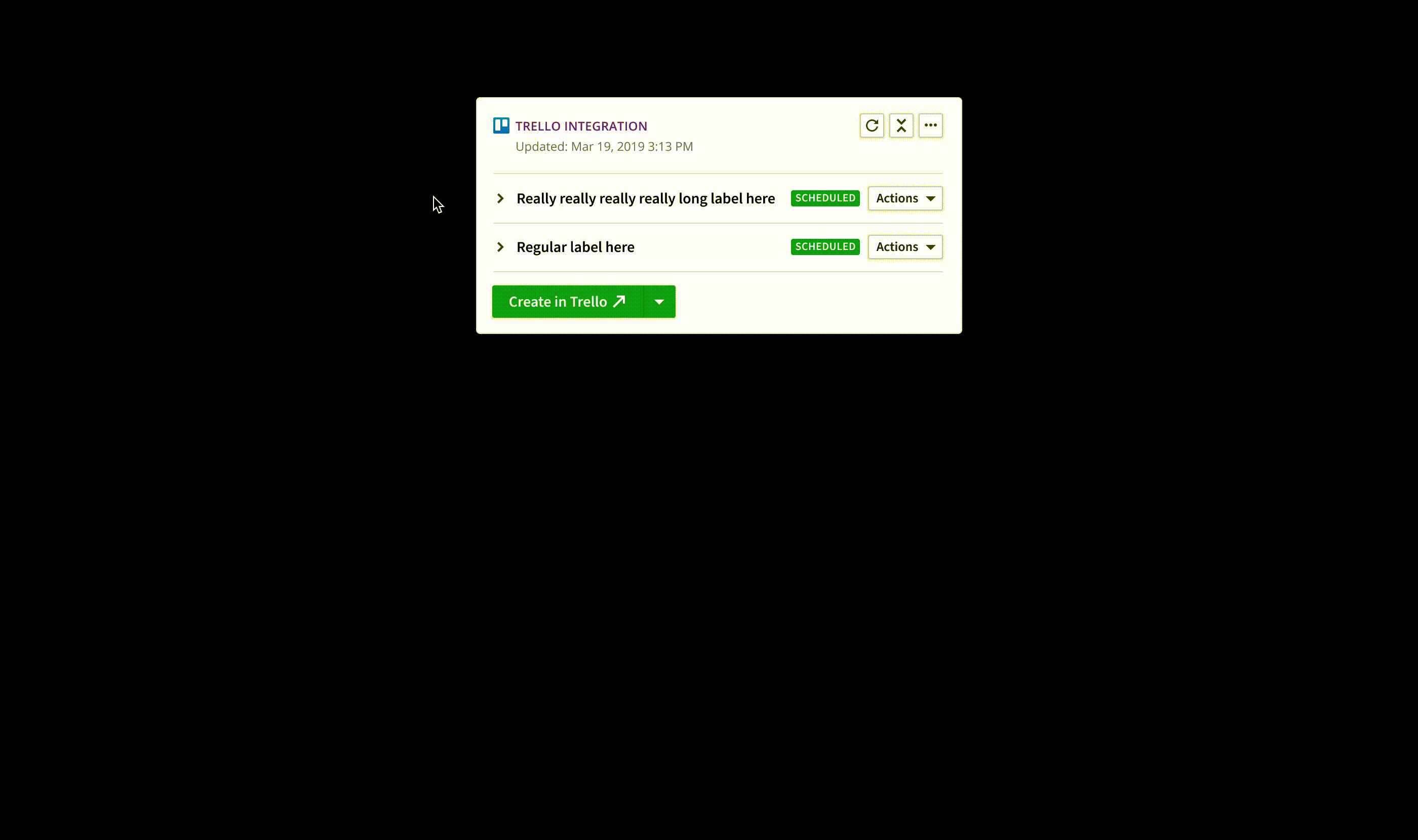
- Object-level actions placed in the panel header
- Field-level actions next to individual data fields
- Global actions grouped under a main action button
This allowed users to perform meaningful tasks without leaving the panel or breaking their workflow.
Prototyping and Validation
To validate the interaction model, I created animated prototypes in Figma. These helped:
- Demonstrate how interactions would work in practice
- Align designers, product managers, and engineers
- Identify edge cases before development
Motion and interaction were critical to communicating intent, especially since many of the improvements were subtle but impactful.
Collaboration and Delivery
Throughout development, I worked closely with engineering and product to:
- Ensure designs aligned with Marketplace and app schema constraints
- Refine interaction details during implementation
- Maintain consistency with existing Pipedrive UI patterns
This close collaboration helped ensure the solution was both usable and technically viable for the wider ecosystem.
Results and Impact
The release delivered clear improvements:
- Action discovery increased from roughly 30 percent to around 50 percent within the first month
- Integrations that adopted the new patterns saw action usage above 68 percent
- App panels became a more active and valuable part of the product experience
These results validated the approach and demonstrated the impact of thoughtful interaction design in platform features.
What Comes Next
This work opened the door for further improvements:
- Expanding interaction patterns for more complex integrations
- Refining guidelines for Marketplace partners
- Continuing to iterate on discoverability and usability