the steps
Four steps, always in view
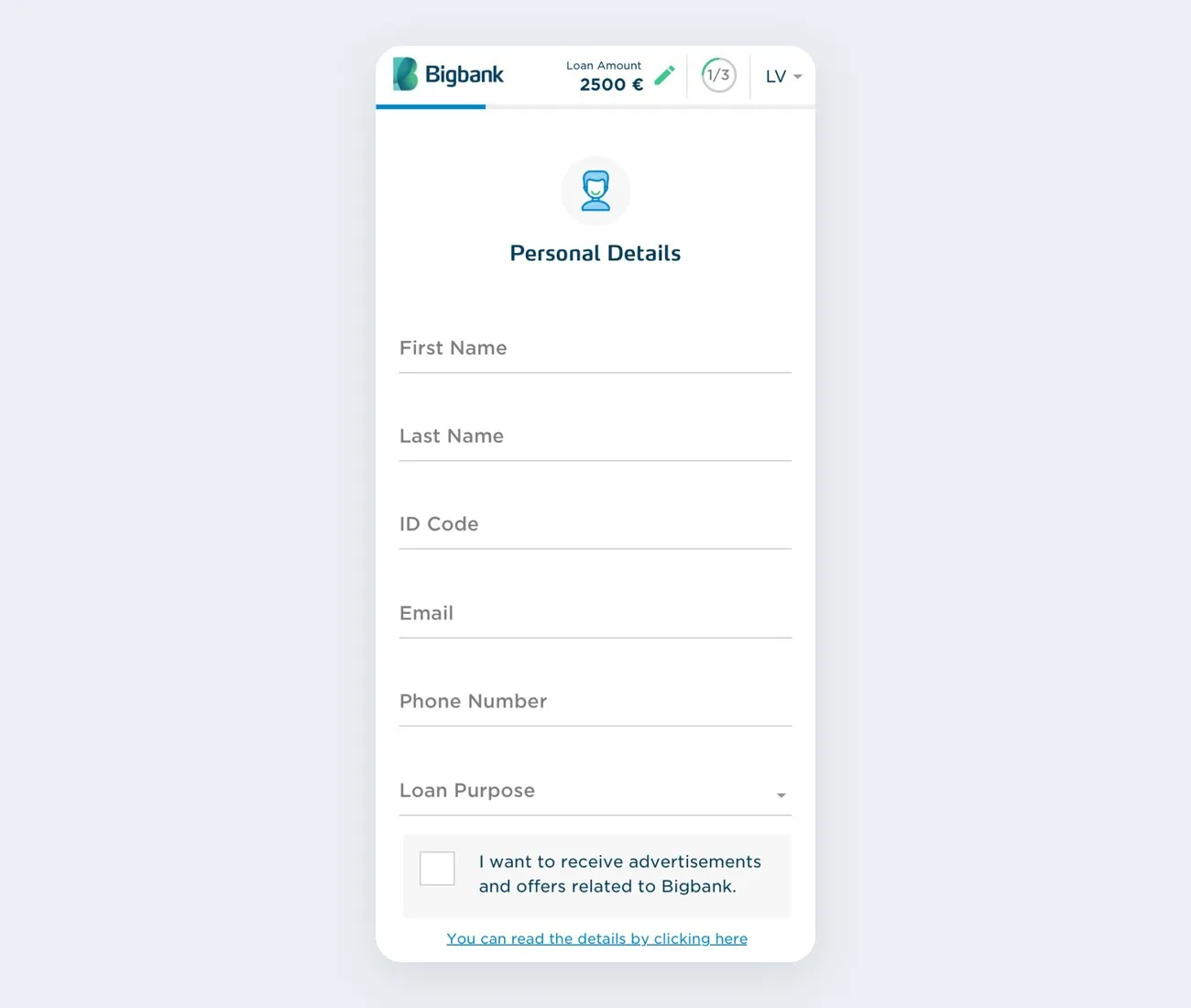
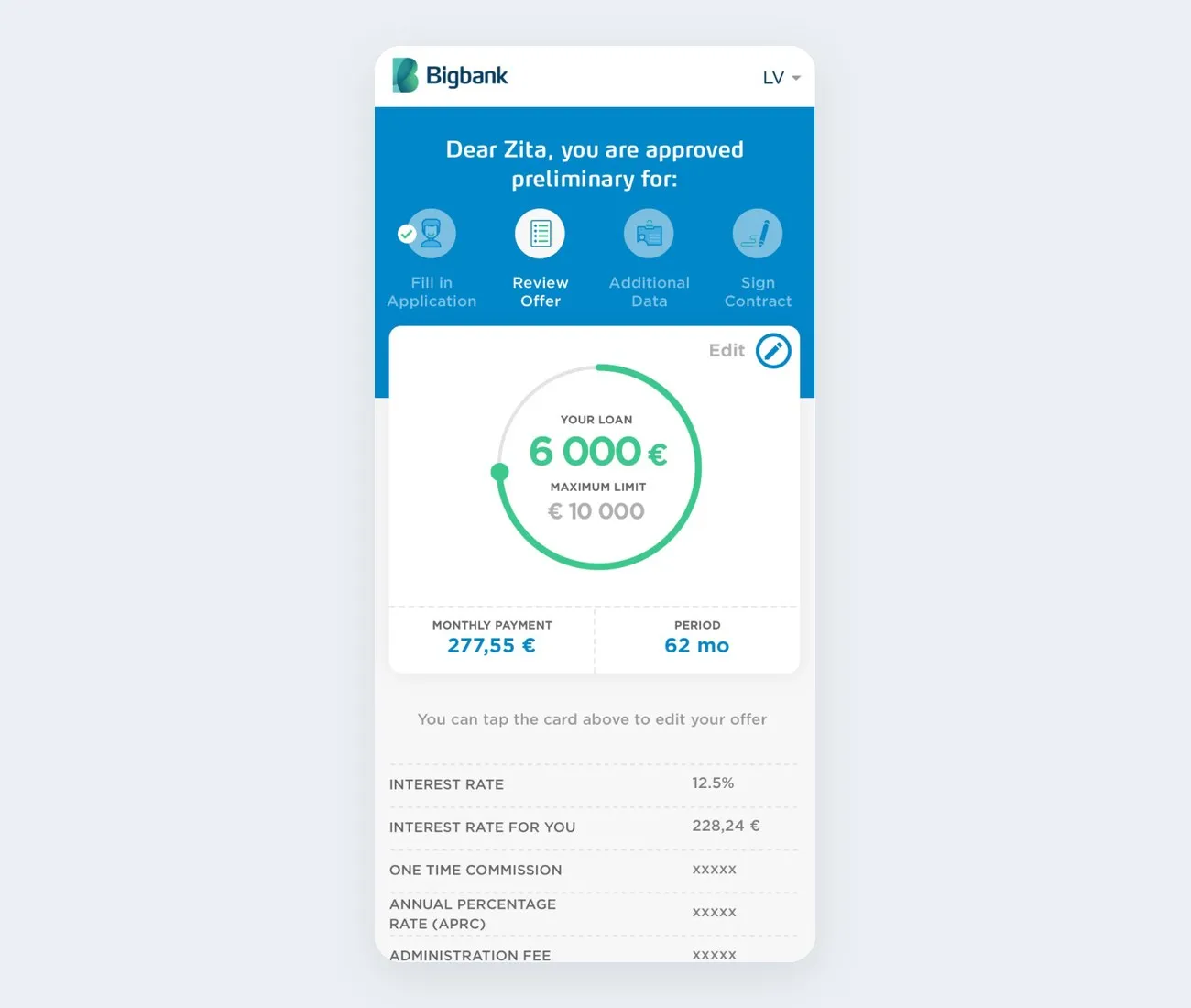
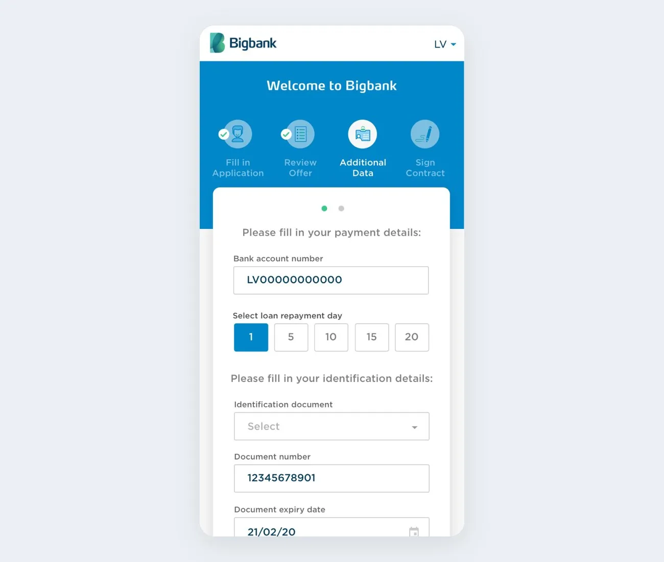
The applicant always sees where they are: Fill in application, Review offer, Additional data, Sign contract. A finished step gets a check mark.
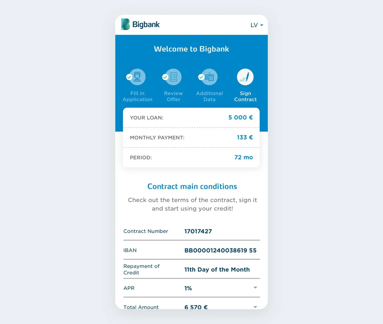
Bigbank · 2019 · loan application flow
One of my first projects at Bigbank. The old loan flows had no real personality, and each country made its own decisions. We brought them all together under one design language, with shorter forms and clearer steps.
problem
The old application had a basic design, did not focus on users and was different in each country. Approval took a long time and many applicants left before the end.
decision
One application for all countries, with shorter forms and clearer steps.
result
Loan answers came faster, the NPS score went up, and support had fewer manual tasks.
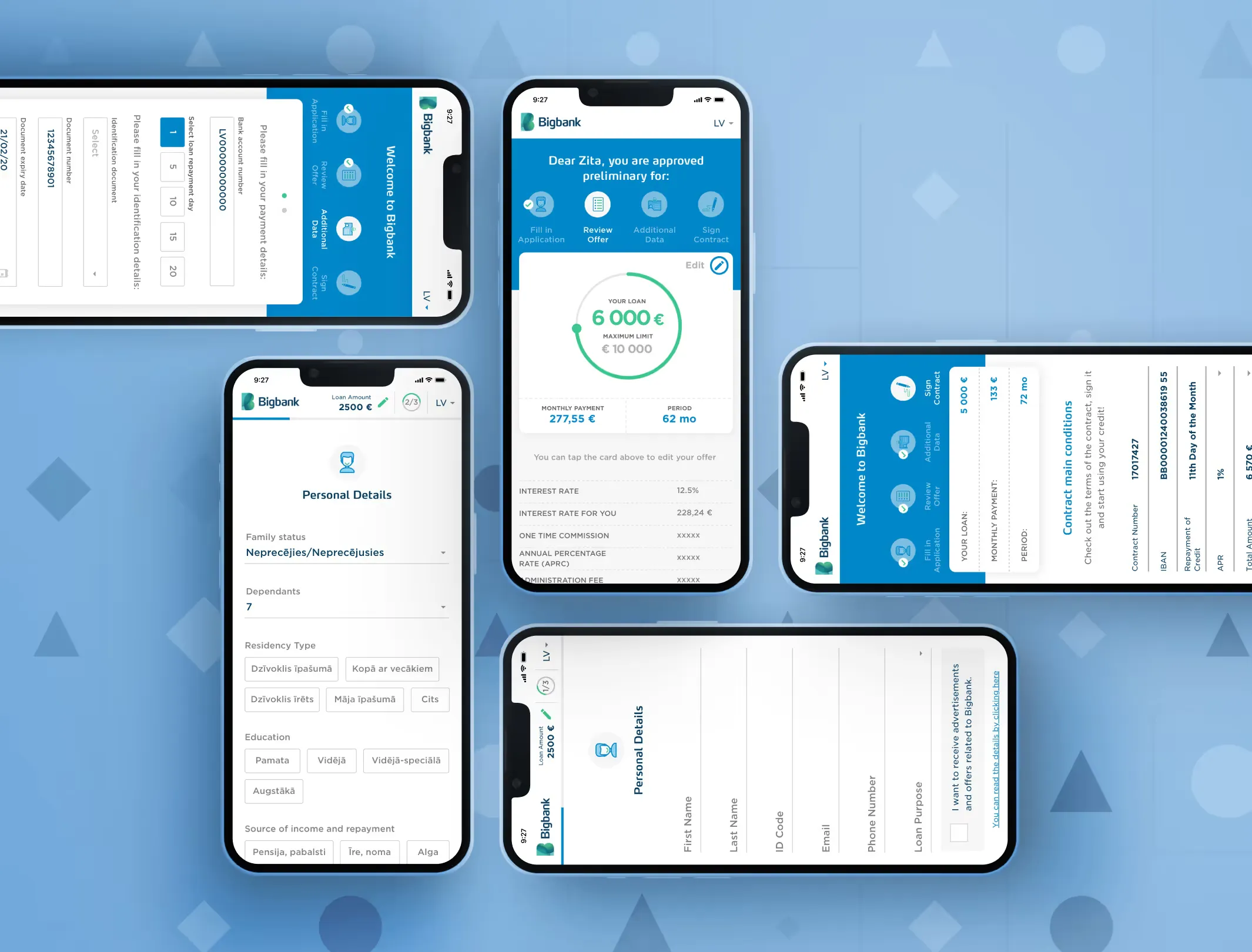
the new flow, screen by screen
the steps
The applicant always sees where they are: Fill in application, Review offer, Additional data, Sign contract. A finished step gets a check mark.
the offer
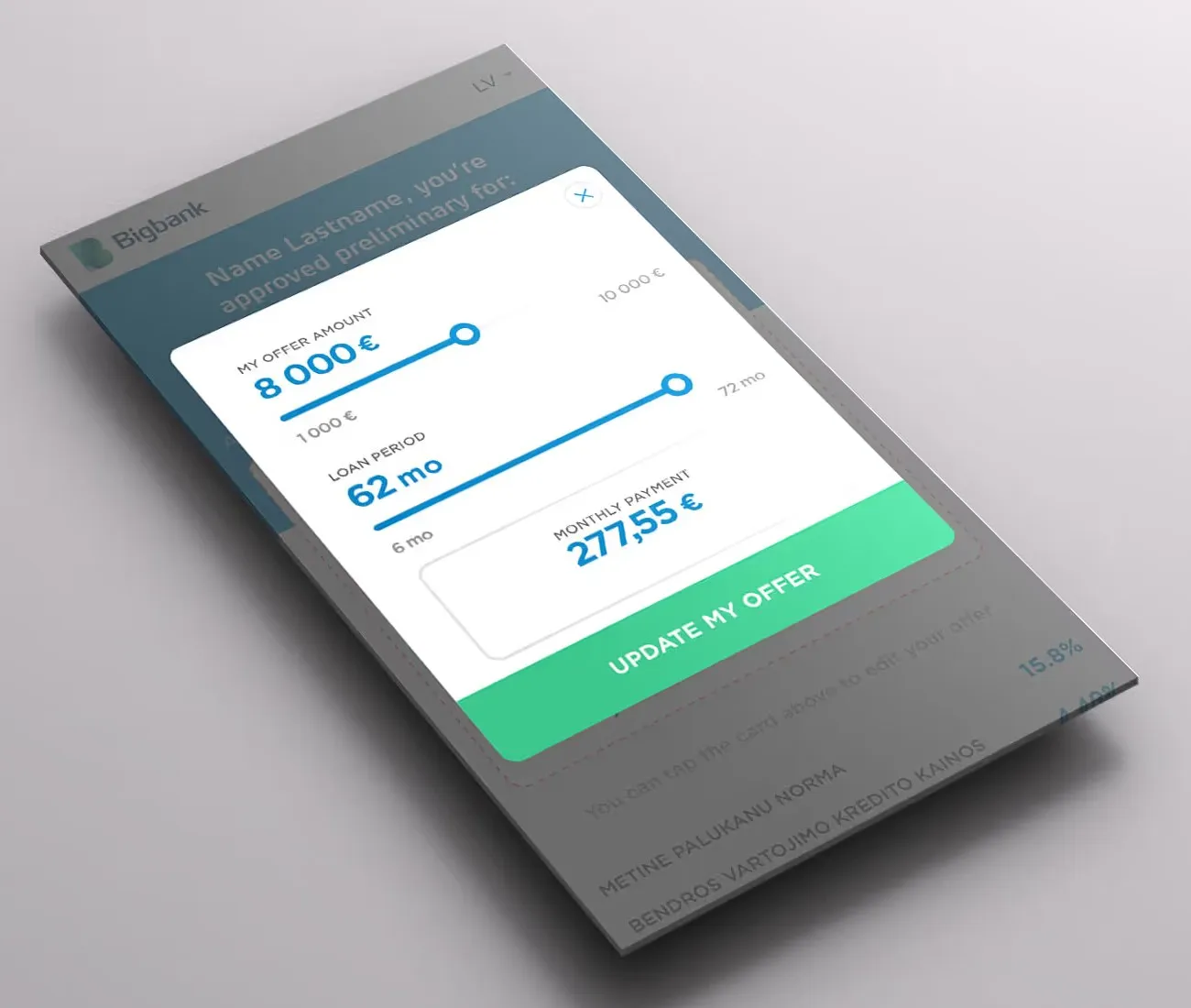
The offer card tells the applicant they can tap it to edit the offer. A tap opens two sliders, one for the amount and one for the period, with the monthly payment under them.
the forms
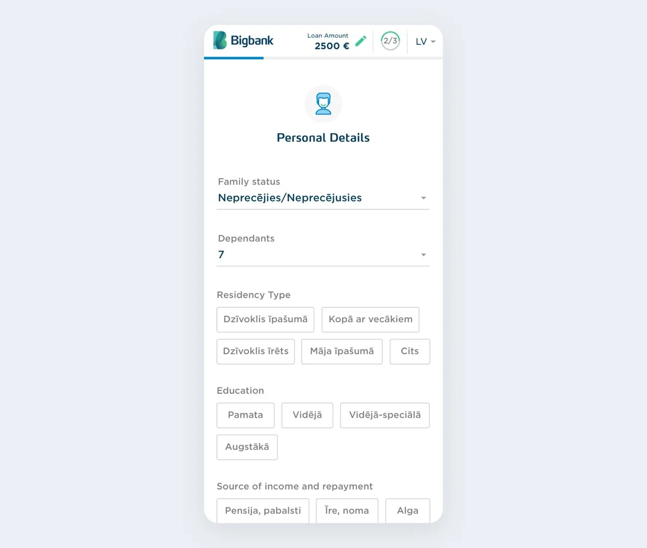
Each screen asks a few questions on one topic. When a question has up to about 7 short options, they show as buttons, because that makes choosing faster. Long lists stay as drop-downs.
the process, short
research
A bank sells money. It must follow regulations and do risk checks, so it needs a lot of data. Each country has its own laws and required checks.
Clients want what the money pays for: a new TV, a broken appliance, a family trip. They have to wait for the bank before they can get it, so they want a fast yes or no. At that time, many loans took days to answer.
We designed each step to collect enough information for the bank to start its decision early. We kept the flow as clear and short as possible. Lawyers, accountants and other teams checked that every question was needed and that none was missing.
scope
Before, each country made its own decisions about its flow. Now 5 countries share one design. We did Finland, Estonia and Sweden together, then I did Latvia and Lithuania alone. Everything is responsive and mobile-first.
the outcome, and what I took from it
outcome
what I learned
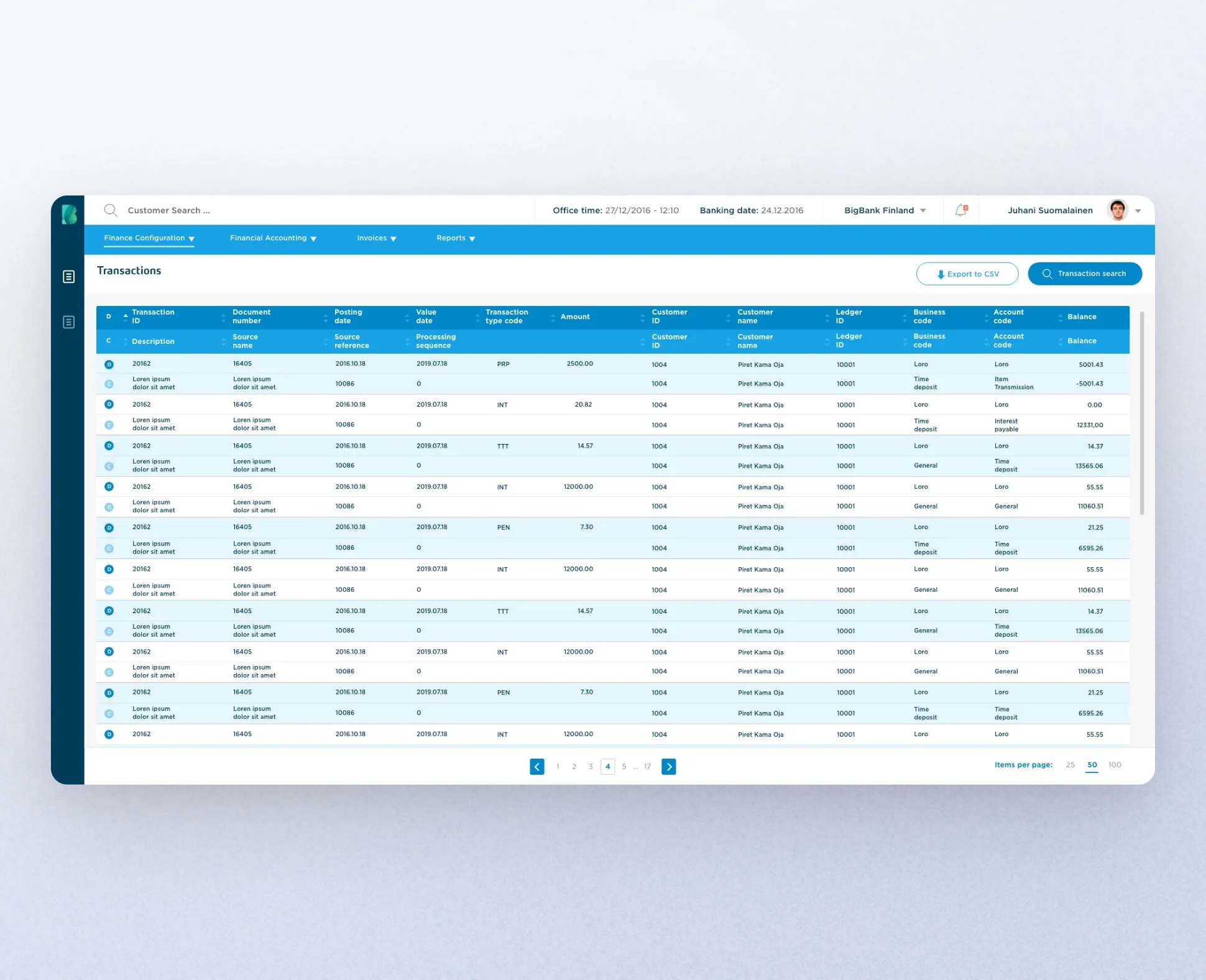
A system made for the bank's accountants, built in-house.
Back-office, Fintech back-officefintech